The Contingency Table and Metrics
| True + | True - | |||
|---|---|---|---|---|
| Pred + | TP | FP (Type I Error) | → | PPV/Precision |
| Pred - | FN (Type II Error) | TN | → | NPV |
| ↓ | ↓ | ↘ | ||
| Sensitivity / TPR / Recall | Specificity / TNR | Accuracy |
Metrics - Pred given Truth
We’re doing with these.
Accuracy
How well overall did you do with the True labels?
Many caveats, the most important being imbalanced classes. If your labels are 90% “Doesn’t have Rare Disease” you’ll have a trained model that’s really good at saying you don’t have the disease. You’ll have super high accuracy. But is that a good metric?
Sensitivity / TPR / Recall
How many of the True Positives did you get right?
Specificity / TNR
How many of the True Negatives did you get right?
F1 Score
This is the Harmonic Mean of Precision and Recall.
So the F1 Score suffers when you mess with a lot of FP and FNs (messing up being that the arithmetic mean of the two is high). This is a good thing!
Now you can have a Macro F1 which calculates the score and averages them and treats all classes equally. Or you can do a Weighted F1 which accounts for class imbalance and weights scores based on instances. This last part may be better than Accuracy in some cases.
AUROC and ROC
ROC plots the TPR (Sensitivity) versus FPR (1 - Sensitivity) for each “operating point” or threshold. The area under the curve is AUROC and is . Hides information on Class Imbalance effects, Calibration, and Prevalence effects.
What does this tell you? It’s all about ranking. What is the probability that if I picked a (Sick Patient, Healthy Patient) tuple, my model will rank the sick patient higher?
Calibration
Small example. Imagine you have 10 patients. 4 actually have the condition (call them sick), 6 don’t (healthy). Your model gives each a risk score between 0 and 1. Here are the scores, sorted highest to lowest, with their true status:
| Patient | Risk Score | Truly sick? |
|---|---|---|
| A | 0.95 | ✅ sick |
| B | 0.88 | ✅ sick |
| C | 0.72 | ✅ sick |
| D | 0.65 | ❌ healthy |
| E | 0.51 | ✅ sick |
| F | 0.40 | ❌ healthy |
| G | 0.33 | ❌ healthy |
| H | 0.21 | ❌ healthy |
| I | 0.15 | ❌ healthy |
| J | 0.08 | ❌ healthy |
Now you look at (4 sick 6 healthy 24) tuples. Looking at the table above, you have 23 correct answers (rankings!). Your AUROC is a solid . Hooray! Not so fast. If you divide each Risk Score by 10, you will still get the same AUROC. That’s Calibration for you; this says nothing about calibration!
Using this to Pick Thresholds
You can pick a threshold1 using the curve but that’s not a nice thing to do in healthcare in general. You have to account for the cost of misses, cost of false alarms, resources, and so on. If only it were that simple.
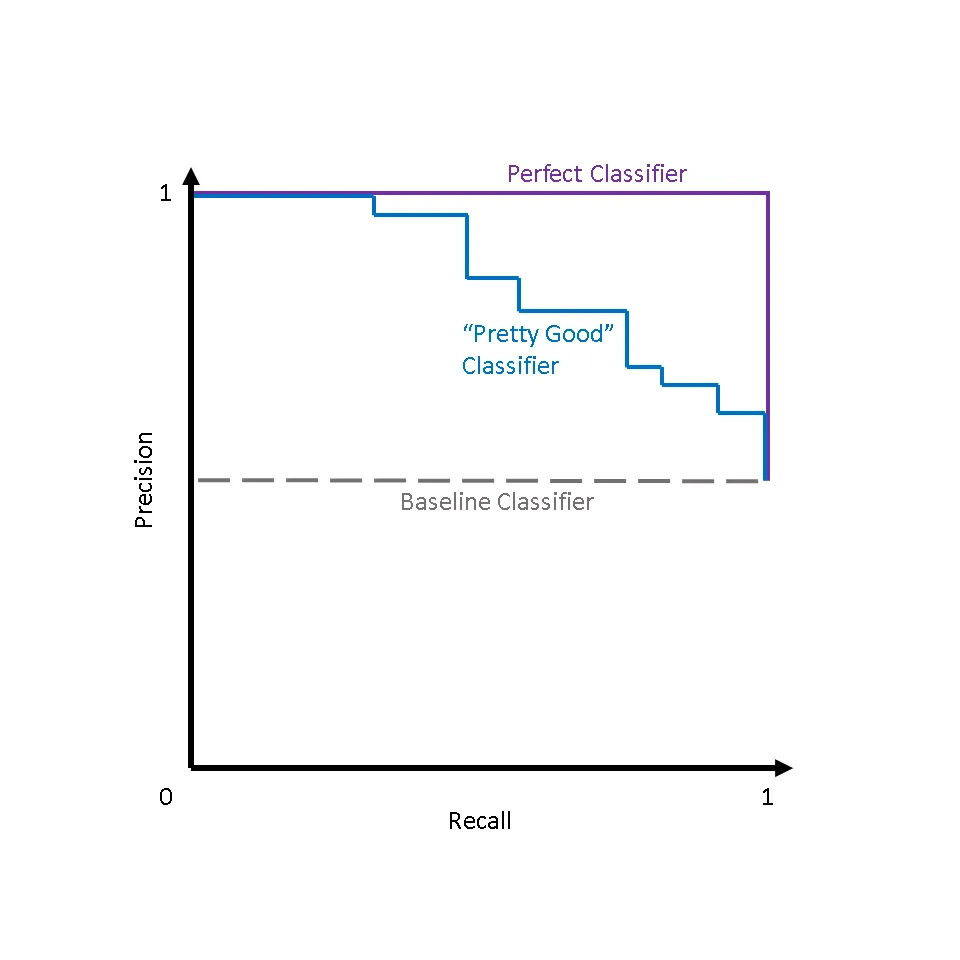
Precision and Recall
TODO: Finish this.
Metrics - Truth given Pred
We’re flipping and doing with these.
Positive Predictive Value / Precision
Depends on Prevalence (# of positive cases)
Negative Predictive Value
Doesn’t come up much really.
Other Metrics
Risk Ratio
Risk Ratio is the probability of the outcome in the exposed divided by the probability of outcome in unexposed group.
Odds Ratio
Odds of a probability are . Odds are stationed around 1. If it’s 1.5, 50% more, if it’s 0.7, 30% less (“protective” in some cases.)